Designing a Logo: The Basic Rundown
Have you ever wondered how a logo is made?


Wonder no more, my friend, because I am going to take you through the whole process of creating and polishing a logo…in this case, the DOPAMINE logo.
I’ve created various logos for clients over the years, which has given me experience and allowed me to fine-tune my process.
***Disclaimer: I never went to school for graphic design or anything of the sort, so my method may be totally different and even “wrong” by industry standards. However, it works for me. Take as little or as much as you want from it!***
To start, always think about what the brand is all about.
In this case, DOPAMINE was founded on the joy of and addiction to (aka dopamine hit) of spending time in the great outdoors.
The whole concept stemmed from the dopamine hit I’d experience when surfing.
Write down a list of words that describe the vibe and concept you want to communicate.
For DOPAMINE, I thought of words like “joy, happiness, addiction, surfing, nature, laid-back, active, vintage, and retro.”
I then thought of symbols that could be used to show these concepts.
These included “waves, sunshine, smiley faces, and mountains.”
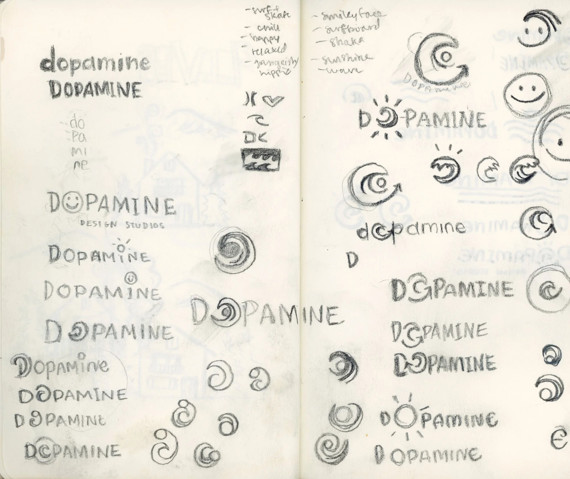
Next, begin to sketch different variations based off of these “word lists.”
These sketches are essentially complete messy brain-dumps. Each scribbly doodle tends to lead to another. I constantly find myself thinking, “well what if I did this instead?” or “maybe I keep this part but add/change this?”
This phase is probably the most fun in a lot of ways because you can literally pop off and create whatever comes to mind without being worried about it turning out looking “good.”
Once you feel like you’ve completely regurgitated every possible idea you can come up with, begin to narrow things down.
It helps to take a break for a bit and revisit your sketches later so you can look at them with fresh eyes and better identify the ones that stand out to you.
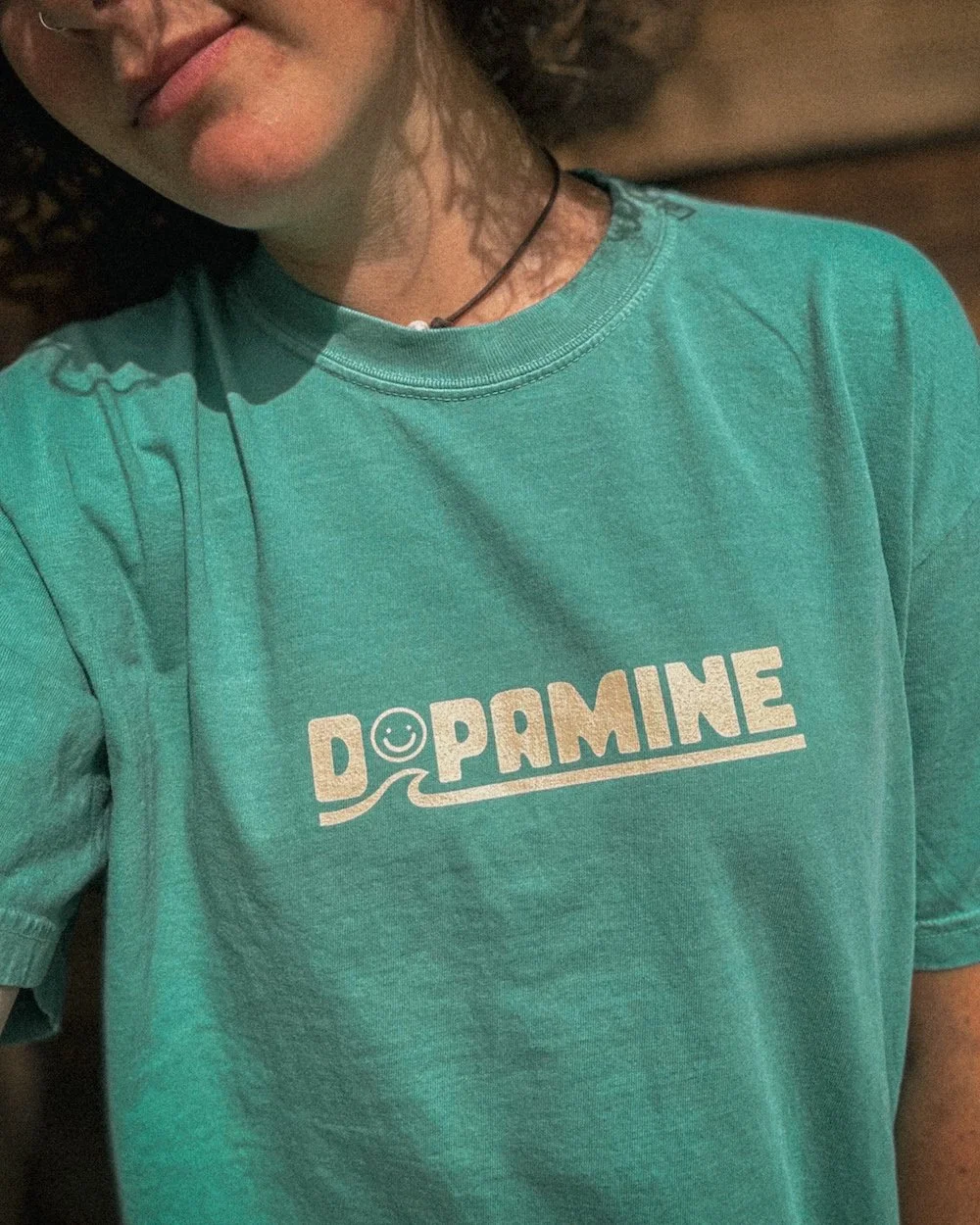
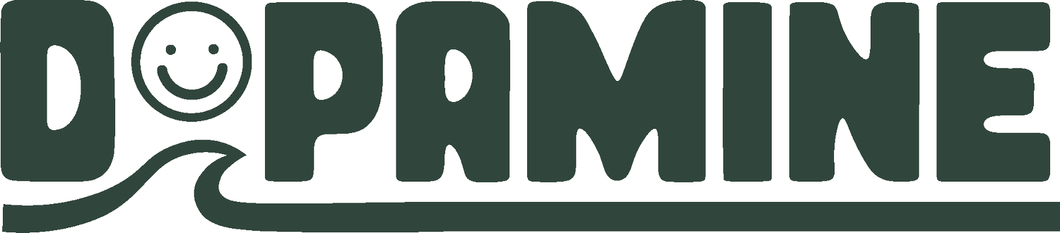
I chose the specific logo variation for DOPAMINE because I felt like it communicated the concept and integrated with the text in a creative but effective and legible way.
Next, I polish them up even more.
To do this, I first experiment with different fonts for the text.
I bought a few fonts off of Creative Market and used a few from Adobe that I felt could fit the vibe of DOPAMINE.
I go back to my word list and the meaning behind the brand in order to find a font that best represents the overall aesthetic.
I chose my top three and put them side by side to compare.
It helps to get a second or third opinion when it comes to stuff like this, so I asked my best friend (who has excellent design taste) what her thoughts were.
In the end, I agreed with her opinion and selected the top font below!

Now for the real polishing.
I will forever prefer the feel of traditional media, but when it comes to logos, polishing them off digitally is a much more efficient and practical method.

So no matter how polished it looks in my sketchbook, I always finalize it in Adobe Illustrator.
You can also upload your image into Procreate and trace it that way, but I find that with Adobe Illustrator, you can really create a more seamless, polished, and professional logo.
I’m not going to get into all the nitty-gritty details of Adobe Illustrator here (though if you are interested, let me know and I can create a tutorial for ya!).
Because I wanted it to be more unique, I slightly modified the look of different letters in the font until I was satisfied with the final look.

Next, I polished off the wave and smiley face icon.
When it comes to logos, attention to the most miniscule details is essential.
Even just a slight variation in the angle of an element can completely change the balance of the whole composition. It takes a lot of tiny adjustments and back-and-forths to reach a completely polished, seamless product.
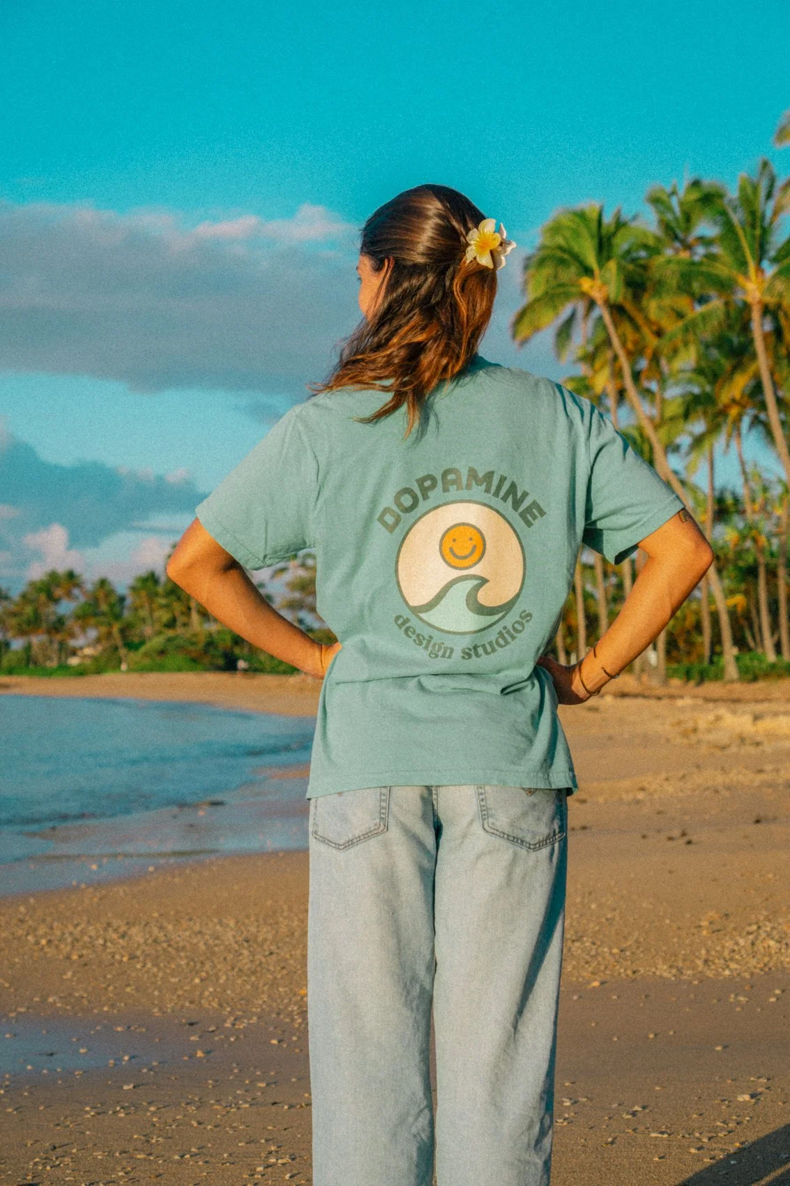
After several hours of minor adjustments (no exaggeration there), the official logo was finally born!
I exported that sucker onto my computer and began to stamp it all over the place.

Thanks for following along!
If you’re interested in a more thorough tutorial, please let me know!
I’d be happy to create one for ya :)